design audit
OVERVIEW
Magnifico Media’s visual audit was conducted with two primary goals:
Establishing a brand look that is unique to MagnificoMedia, visually-compelling, stands apart from competitors, and recognized by customers.
Establishing visuals that are applied reliably inmarketing collateral and congruent with MagnificoMedia’s core values and brand identity.
Assessment
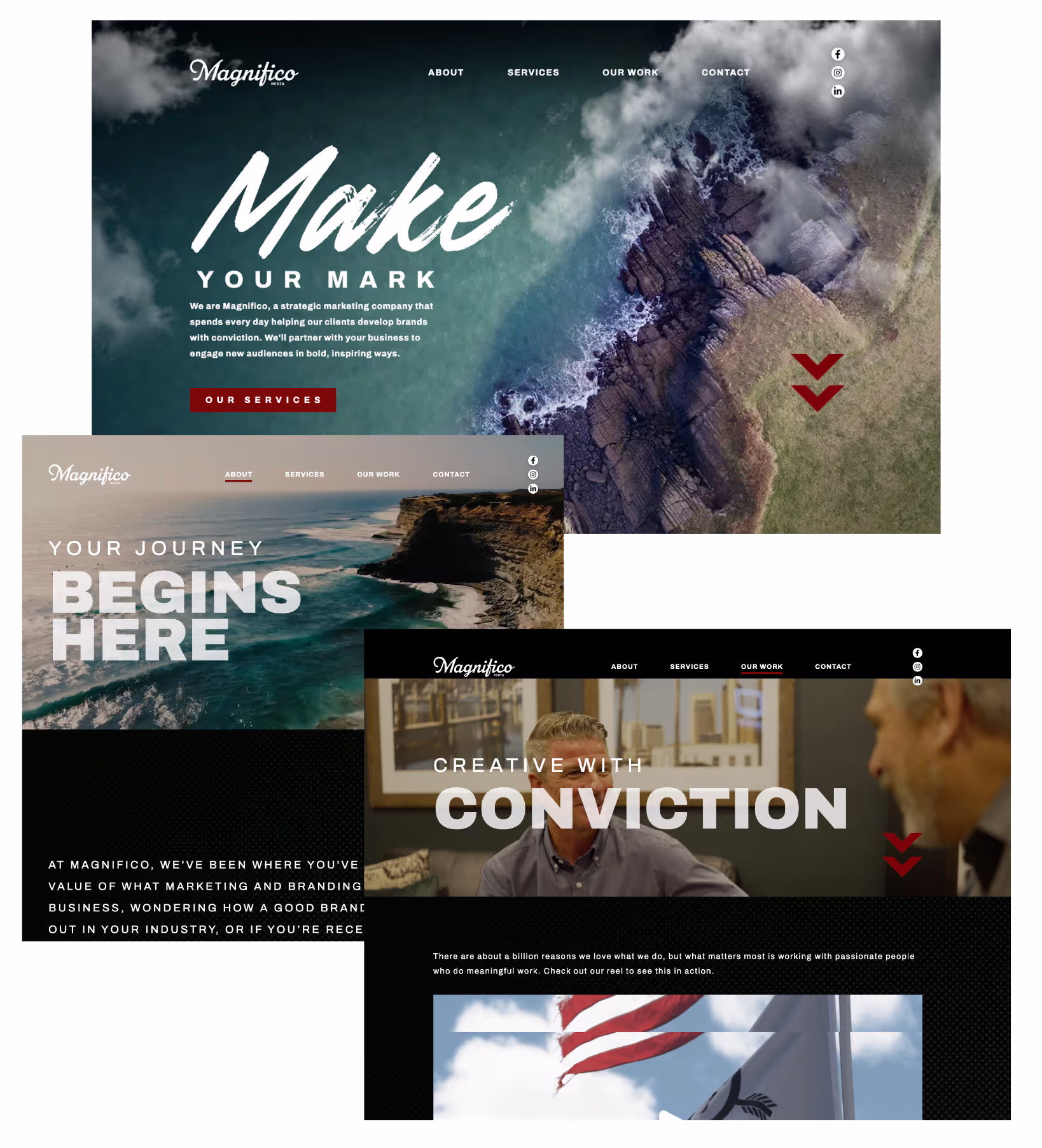
Tone is down-to-earth, speaking directly to the reader.
Language continually relates marketing to a journey.
Portfolio write ups are sparse but do a good job explaining each project. Inspiring visuals and real numbers would make a stronger case.
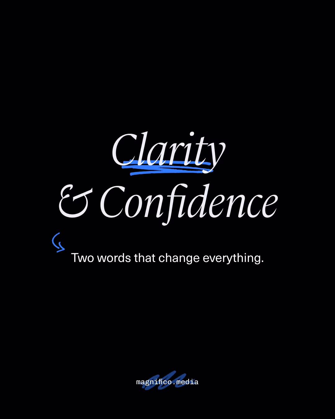
Light-hearted language like “Let’s Roll” helps balance heavy words like “Conviction” and “Belief”.
Messaging communicates a sense that Magnifico can assist with uncovering stories and help with marketing, but I’m left wondering what that process looks like and why it’s important/better.
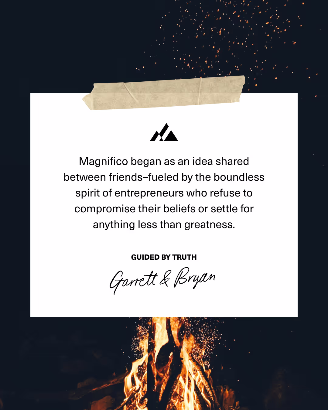
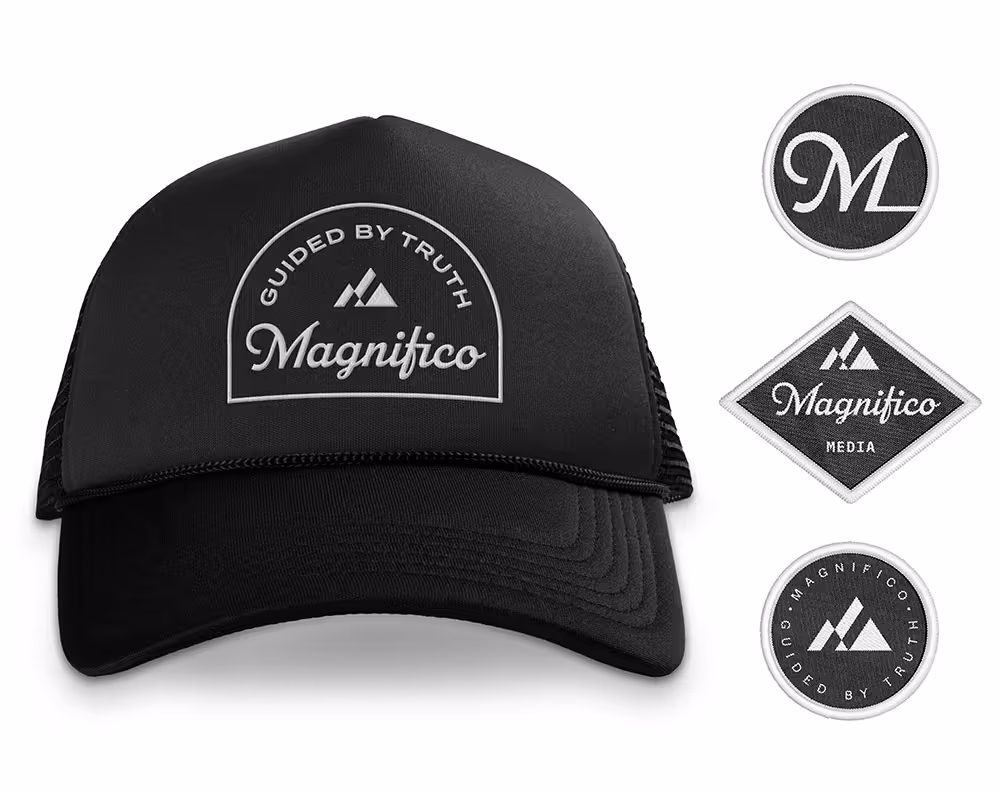
Logo has a nice vintage flare that could inspire other visual elements
Overall feel is very outdoorsy and heavy. Everything is bold from black backgrounds to strong typefaces.
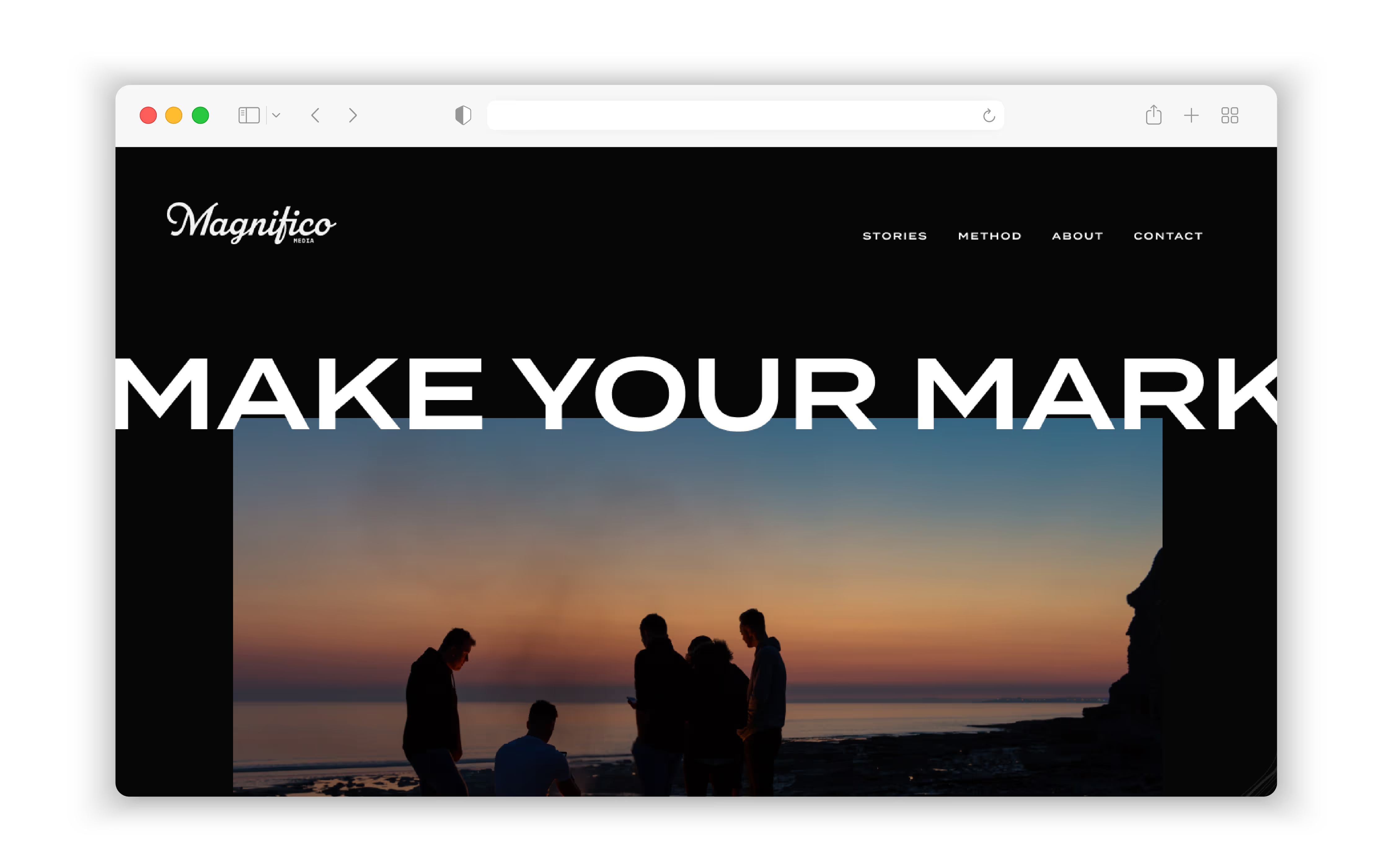
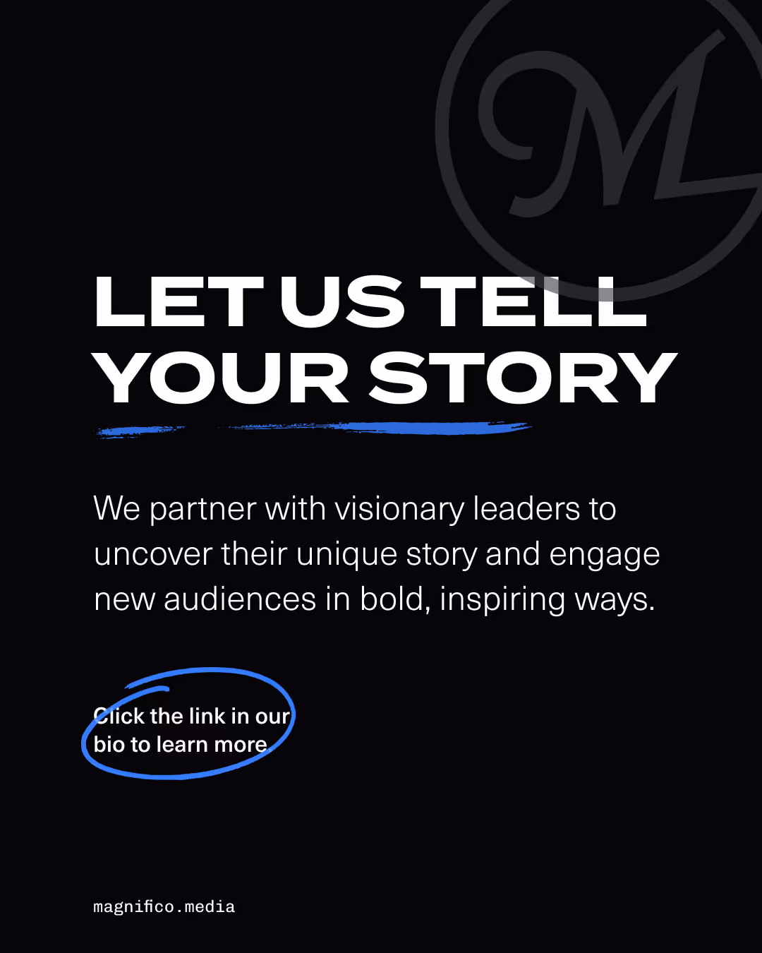
Homepage visuals do not communicate “marketing” so reading the text is necessary to understand what Magnifico does.
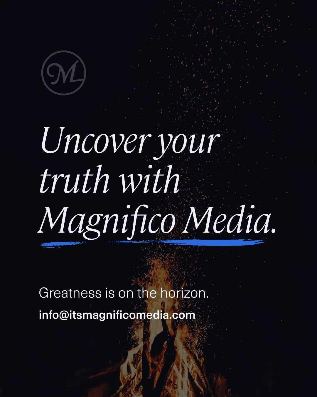
Strong/heavy graphic elements throughout: bold, all caps type; the deep charcoal and red colors; full-screen photos.
Stock photos and videos are more forgettable than the footage created by Magnifico.
Red can be difficult to read on dark background (in footer).
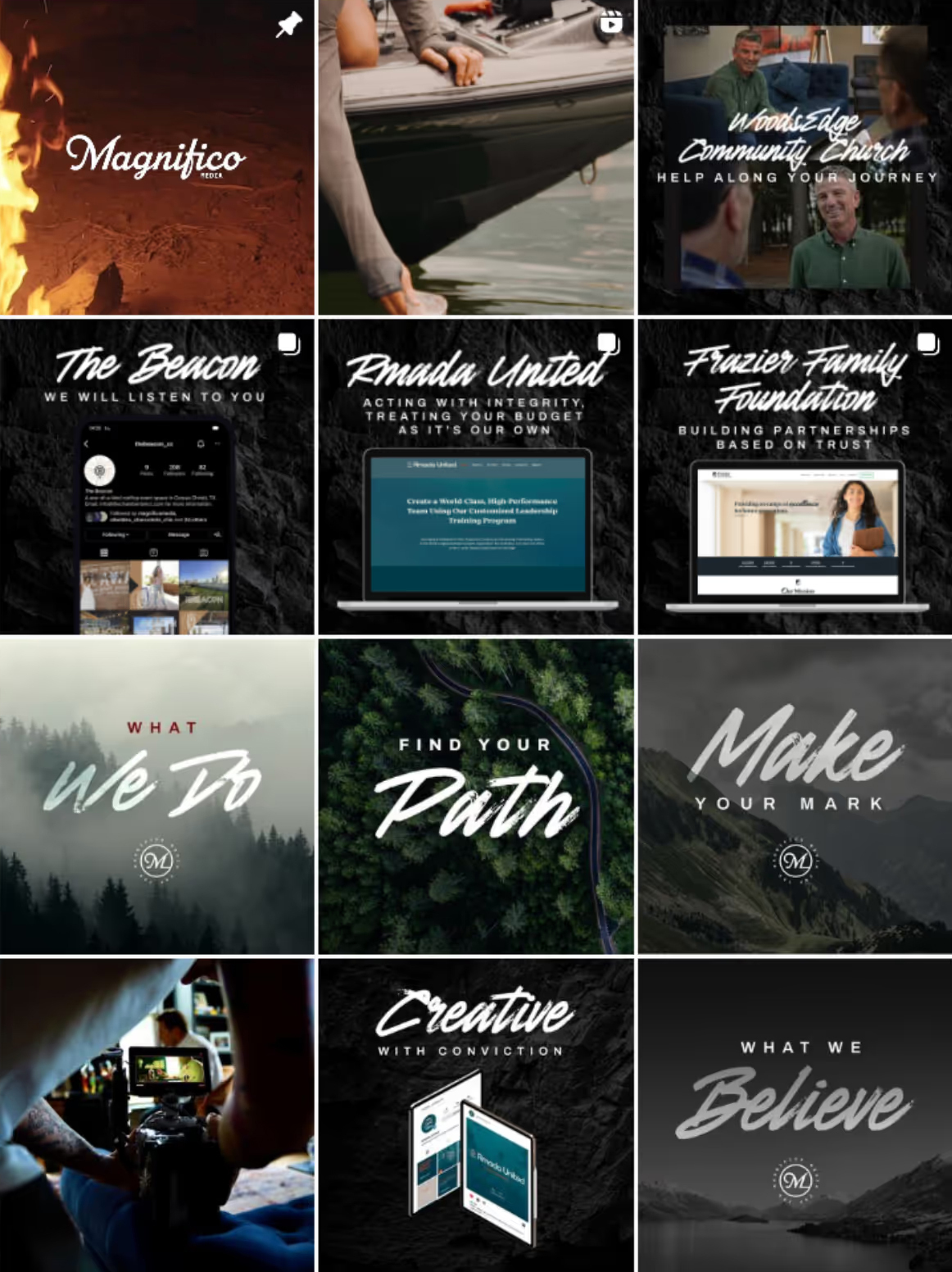
Branding is consistent with website.
Overall feel is very dark/heavy.
Mockups look slightly dated.
Not a lot of “eye-candy” creative work with the exception of the videos.
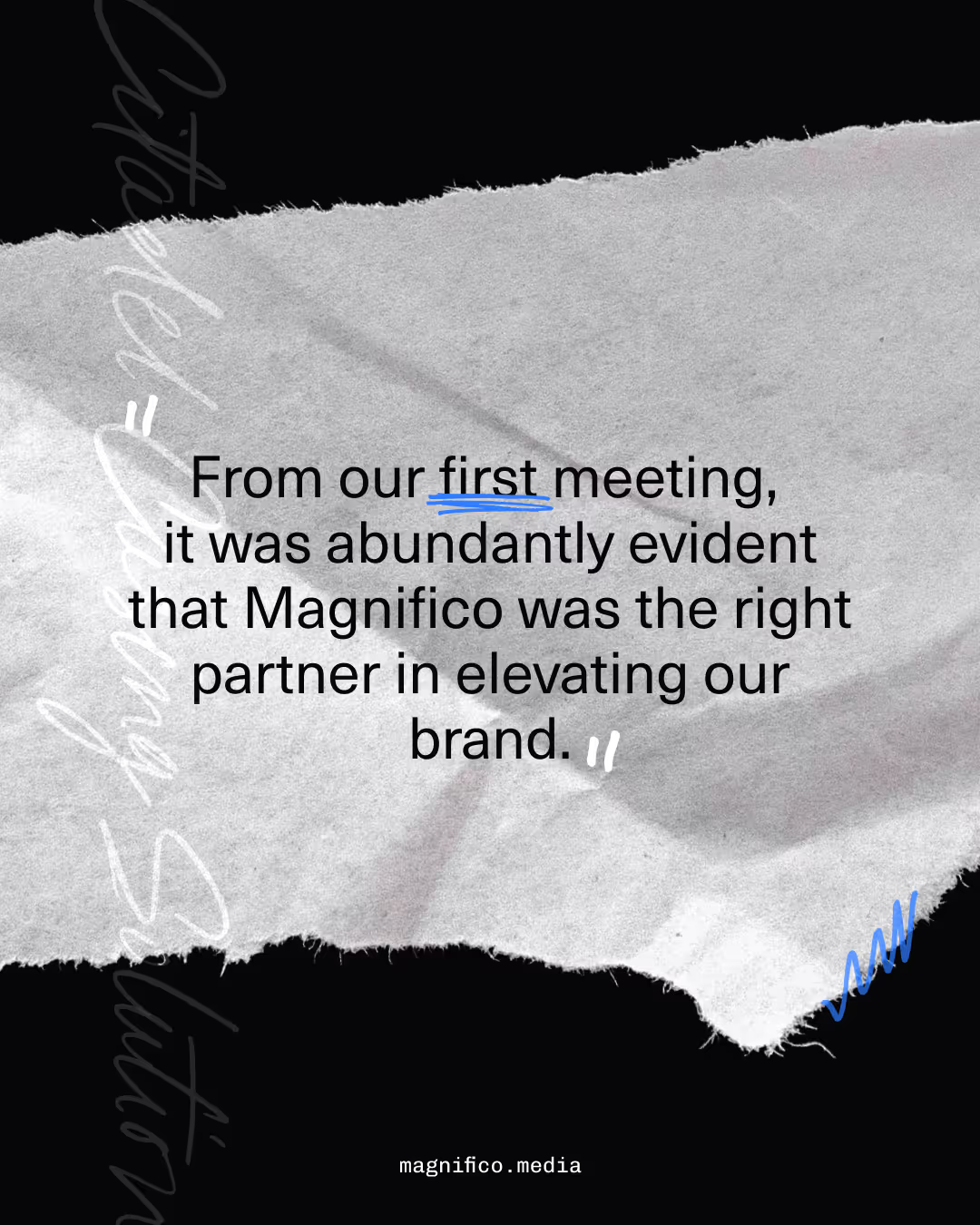
Posts stay focused on Magnifico and the reader vs. telling the client’s story.
At first glance, it was unclear if the taglines were about the client or Magnifico.
Some captions come across as a sales pitch rather than a celebration of the client.
Keep brand voice relaxed and personable—speaking to the reader directly and relating Magnifico’s capabilities back to the desires of the hero.
Emphasize a focus on finding truth and meaning in each client’s story and in Magnifico’s own work.
Messaging can be used to show what Magnifico’s process looks like and why it’s important/better. Is there any proof that meaningful stories work? Can we show that through research or Magnifico’s own experience?
There’s an opportunity for more robust portfolio examples and social engagement especially as bigger projects wrap up and there’s more visuals to show, customer experiences to share, and data to report.
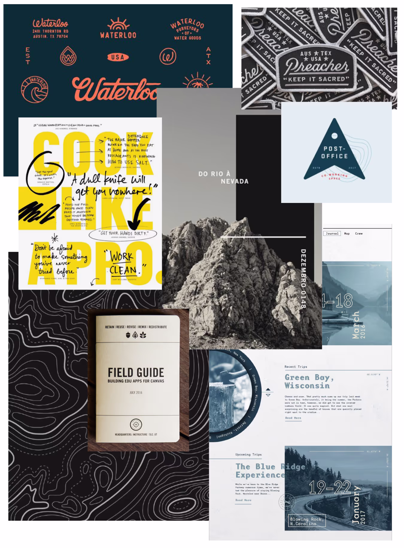
The brand visuals lean masculine, “outdoorsy”, and communicate the idea of a journey. There’s an opportunity to expand the graphic elements and create a look that is visually rich and unique to Magnifico. Let’s explore creative ways to incorporate visuals that cue “journey” beyond the outdoor photos.
Video clips of cowboys, hunters, fishermen, mma fighters, and trucks feel targeted to a specific audience: men from the southern and western US. Visual variety showing women and some indoor setting would speak to a wider audience.
When the only imagery is outdoor photos, it can feel like an outdoor brand, but the compilation videos on instagram and the “Our Work” page do a great job of showing the people and creative work to give potential customers a better idea of what their “journey” with Magnifico will look like.
Graphic Elements to consider:
Patches, Vintage marks, fun/creative lockups to communicate brand values
Scribbles and marks to go with current painted font
Field Guide aesthetic using monospaced font from logo
Map elements and symbols
Interaction between photos, type, and graphic elements
Market Positioning
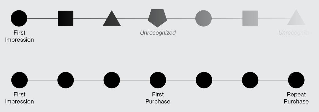
The following graph has been created to plot the brand identity of Magnifico Media and Magnifico Media’s competitors. The position of each company logo on this graph indicates how each of the respective brands is perceived along these dimensions.
Comparing the emphasis placed on helping customers discover their beliefs and purpose vs focusing on pure marketing tactics and strategy
The extent to which they prioritize educating prospects on the agency’s background, process, and status as thought leaders vs selling the prospect on the results of working with them

Design Comps